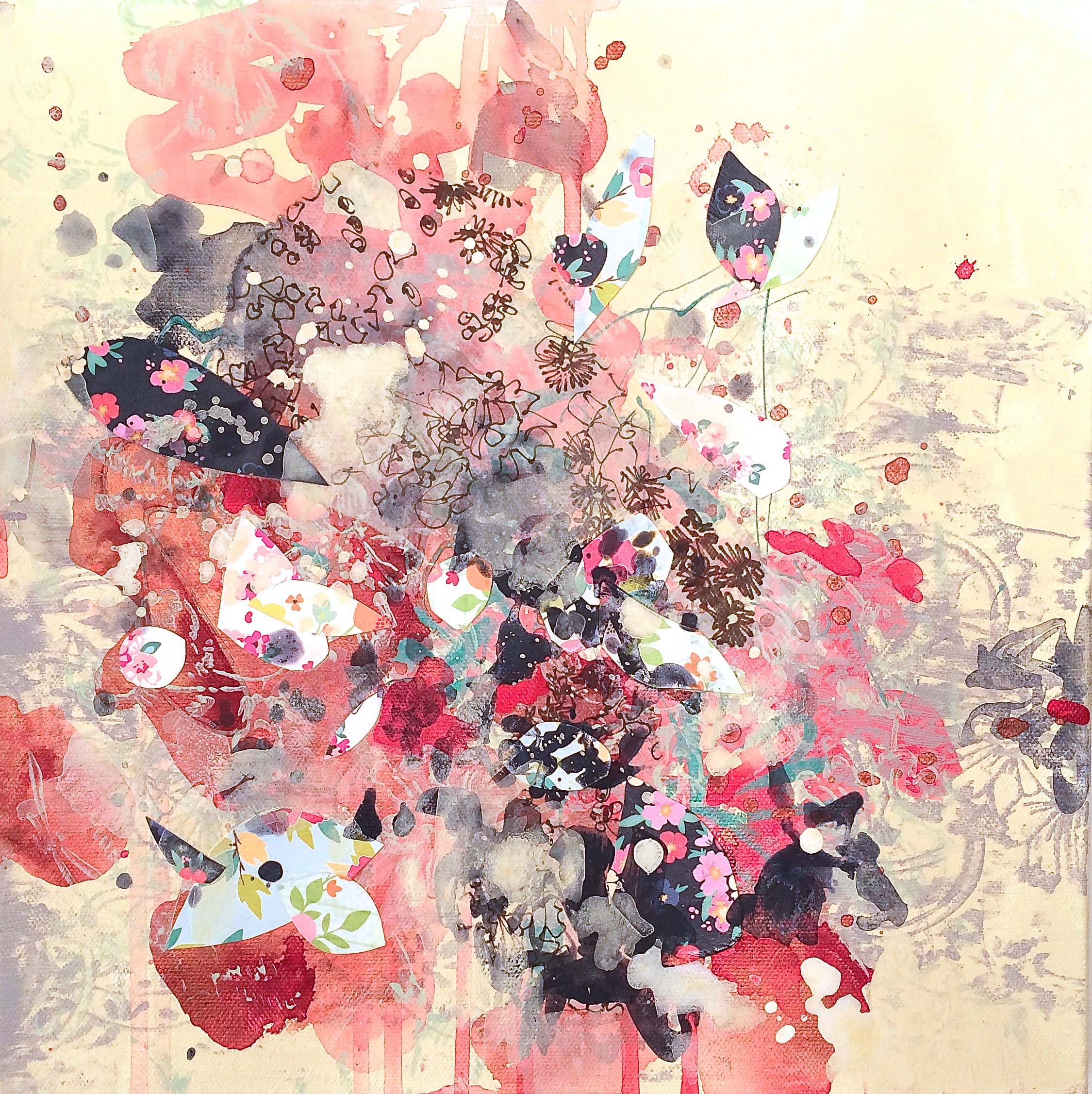
How to make your own abstract Christmas cards (or work in a series of small works)

Christmas Cards 2015 from Kathryn Neale on Vimeo.

Christmas has come and gone! Wow! What a rush!

I did manage to sneak some time in (not sure how) to make about 36 Christmas cards to send to my friends and family this year. Hence the video above I actually figured out a way to tape myself with my iPhone! And it all didn't turn out to be a disaster which can definitely happen quickly if you don't really plan. Found myself thinking about making these things, ordered the stamps and the wasabi tape and when they came it was that moment of . . . "am I really going to do this?" I'm so glad I did! It was so much fun. And it was a joy to have some kind of excuse to do a little painting - which I haven't done in a few months (I always go in and out of bursts of painting energy).

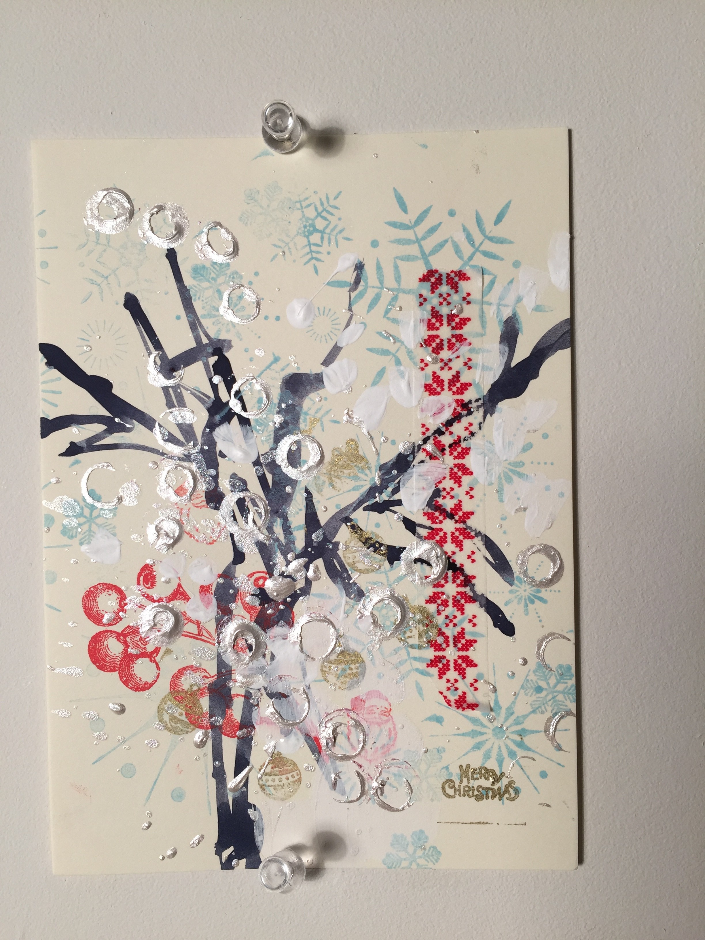
So I thought I would share my thoughts on the project and how you can make your own Christmas cards - OR any kind of small series of works. I realize that there is a sort of method to the madness - especially when you're working very fast, and very small and using similar media elements and layers, I realize there are some "rules" to apply to that make it look like a cohesive series but not all look exactly the same. Each Christmas card is unique. But they all have similar elements or layers that I used and by the end I got really good at varying the beginning of each set of layers but always stuck to the last 2-3 layers by choice. And there are reasons behind all of that.

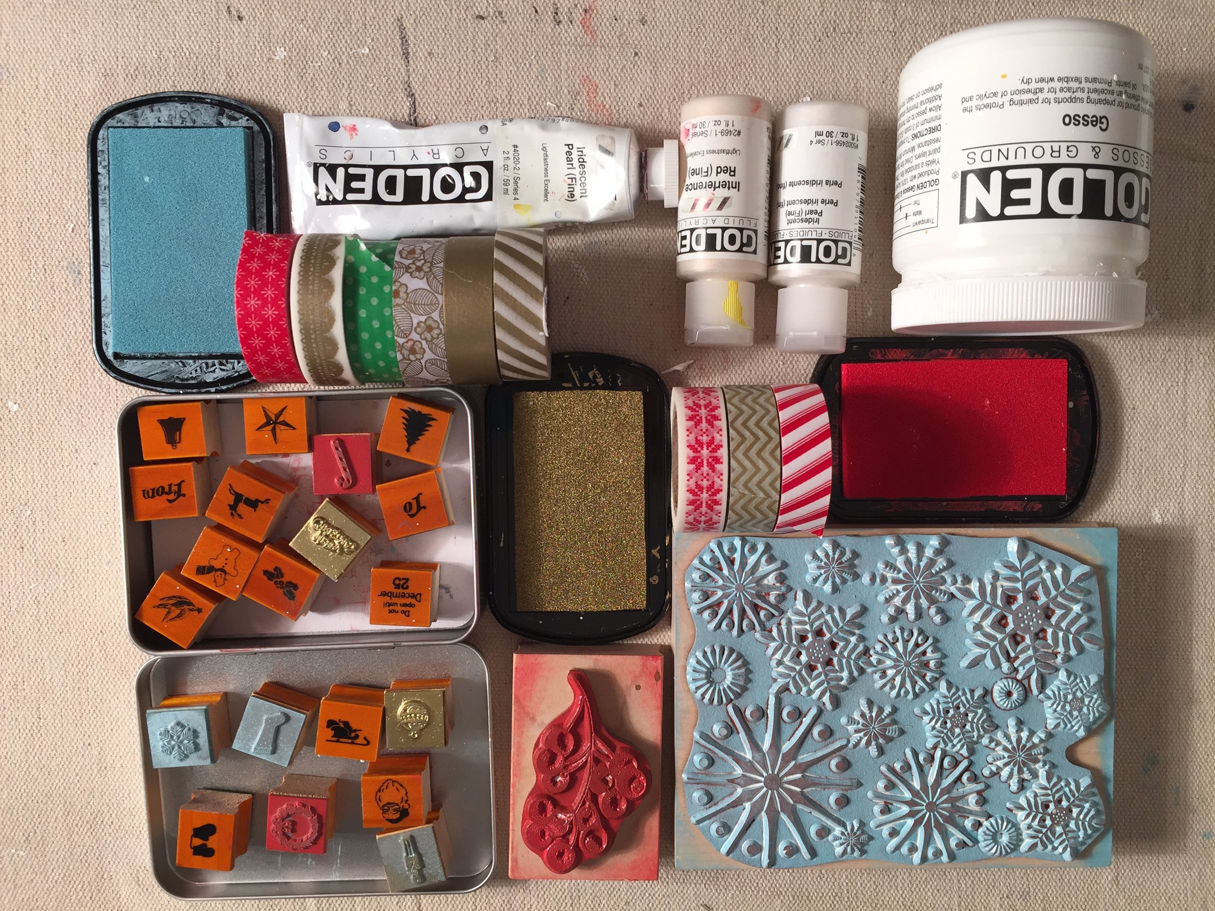
IMG_7182So first, let me introduce my supplies and materials.

1. Choose things that inspire and in this case, are quick and easy for you to apply. For example, for some reason lately I really like Christmas stamps! I'm starting to collect several kinds over the years - 1 is the large design of snowflakes that are just quite beautiful but also very versatile. You can always incorporate snowflakes!

2. In this case, having fun but being QUICK is also a factor. I didn't want to "labor" over these things so I needed to make more of a collage then an actually all out painting. For heavens' sake just making about 34 was enough! :) So choosing this super cute set of Christmas stamps (very small because my cards are small) was also a plus. I didn't have to use all of them - actually I only ended up using about 6 different ones, but it still created a cohesive look using 2 or 3 for each card. One of them (the ornament) I ended up using in all of them as a main layer because I liked the look of them "hanging" from my tree. But more on that later down in the explanation of each layer.

3. Color. Color is very important. Try to use a color palette of 2 or 4 colors. More than that really does make it over the top for the viewer. I limited my color palette with my stamp ink - light blue, red and gold.

4. And wasabi tape also introduces "POP" of color and maybe even more important, PATTERN to infuse a little Christmas atmosphere and also a graphic element. Wasabi tape is used mostly as an "accent" to the piece.

5. An off-white 4x6 card from Paper Source provided the perfect back-drop. I wanted off-white because I subtly wanted the "white" from the gesso and paint to show and not completely blend into the background.

6. Finally, gesso paint that's bright white, and fluid iridescent white pearl paint (in liquid acrylic and solid acrylic) so that I could add a little texture of abstract "snowy" elements. This is a perfect opportunity to use an iridescent paint that almost "glitters" in a way because it even more reflects the light like so many decorations this time of year.

I must add that these choices were completely intuitive. As I write them I am analyzing them with my "left brain" and each one makes sense why I would use these materials. The gold ink palelette was brand new choice for me, I usually don't like gold or am attractive to that color but it worked quite well with the other bright elements of the card.

TIP: Use again what inspires you. It could be Christmas tags, stickers, old wrapping paper elements that you can cut up and use. Parts of magazines or old books that have been torn away. Anything that is graphic--inspired, patterned or particular nostalgic is perfect for Christmas card themes. But again, try to keep it to 1-2 graphic element, 1-3 painterly media, perhaps 2-3 stamps or 2-3 drawing media. The variety comes in putting it all together because each card will end up being different and unique.

****************************************

THE PROCESS:

Tip #1 - Try to use about 8-10 layers at most with such a little space as this. They need to be a variety of materials/media and color. Use what INSPIRES you to HAVE FUN!d o

BREAKDOWN OF MY LAYERS:

IMG_7159 IMG_7158


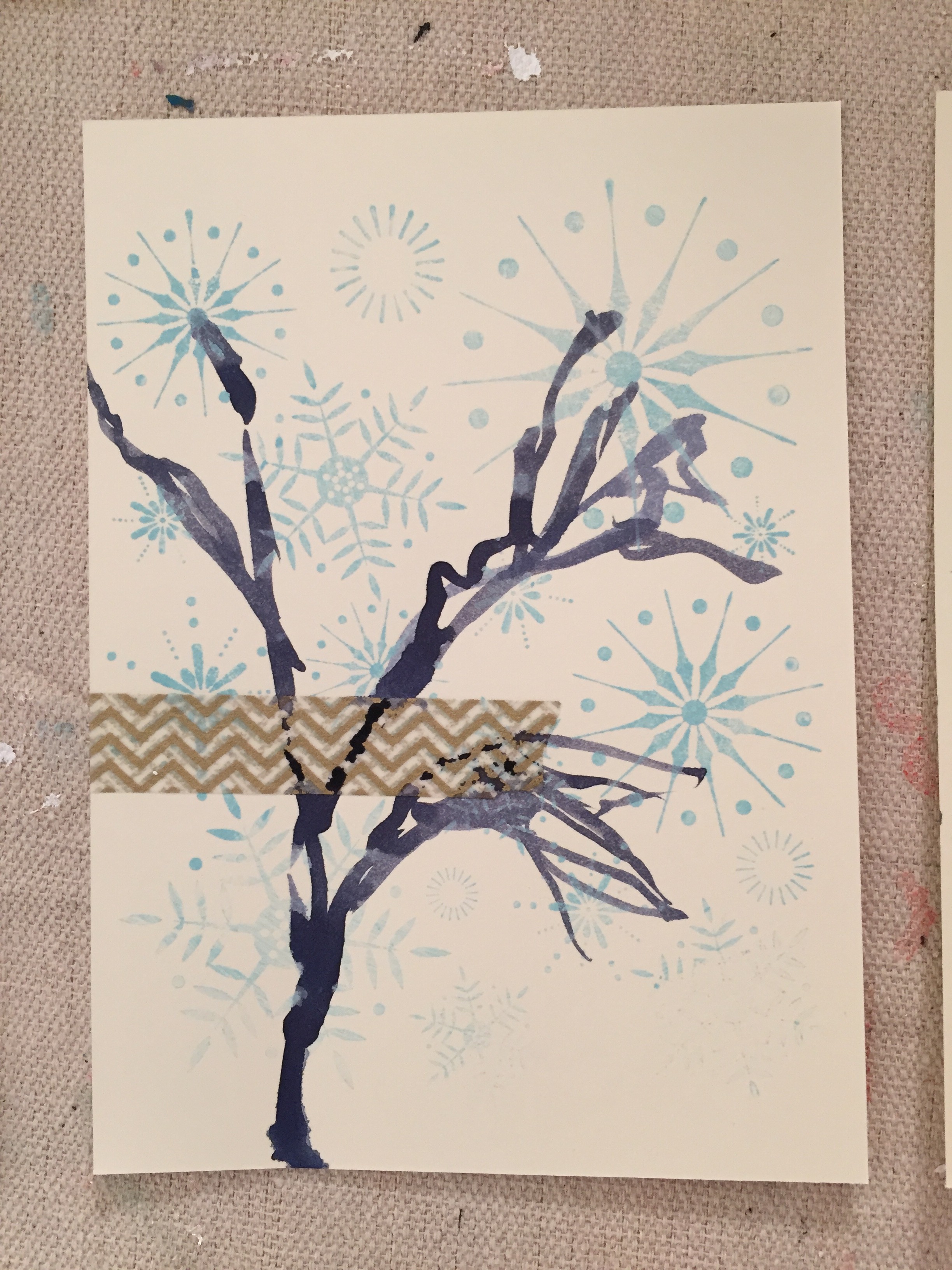
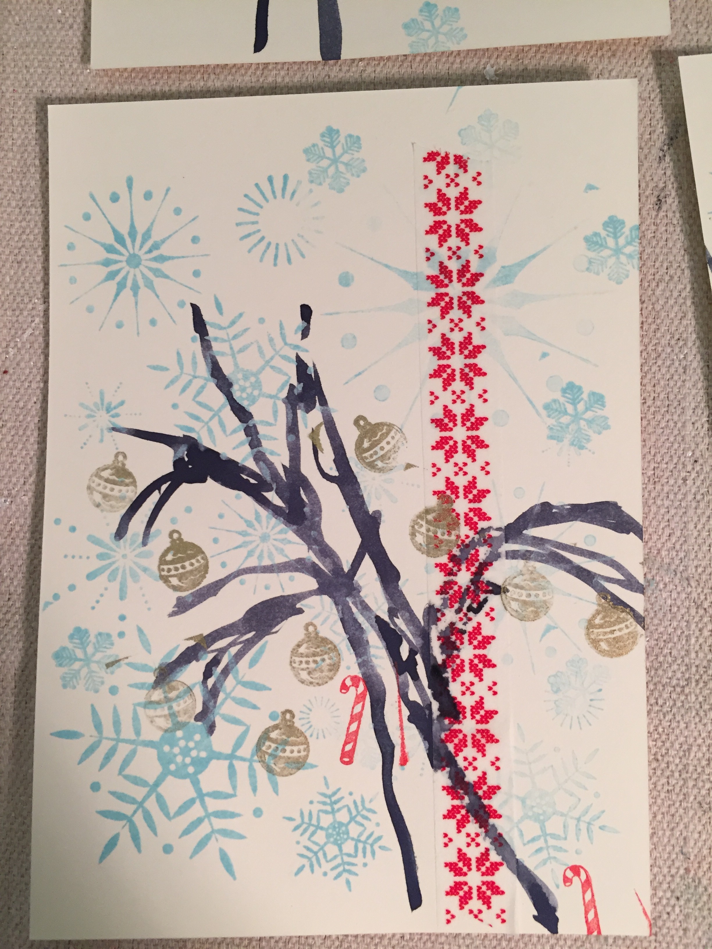
  1. Light-Blue snowflakes
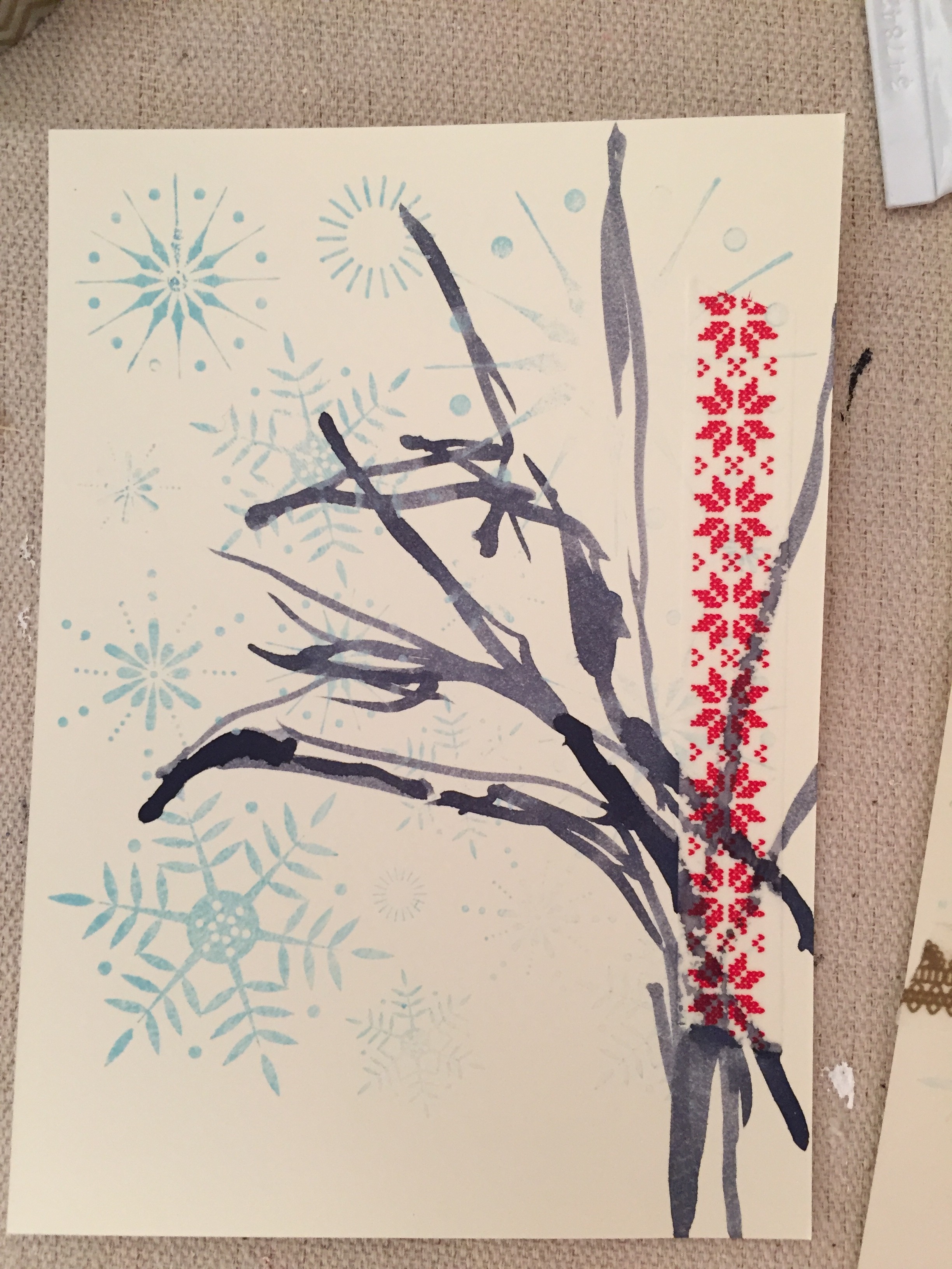
  2. Wasabi Tape
  3. Silhouette of abstracted tree (line quality)

IMG_7162


4. Red stamps of either candy-cane, santa face, wreath, basic image of christmas 5. Gold ornament stamp

IMG_7171


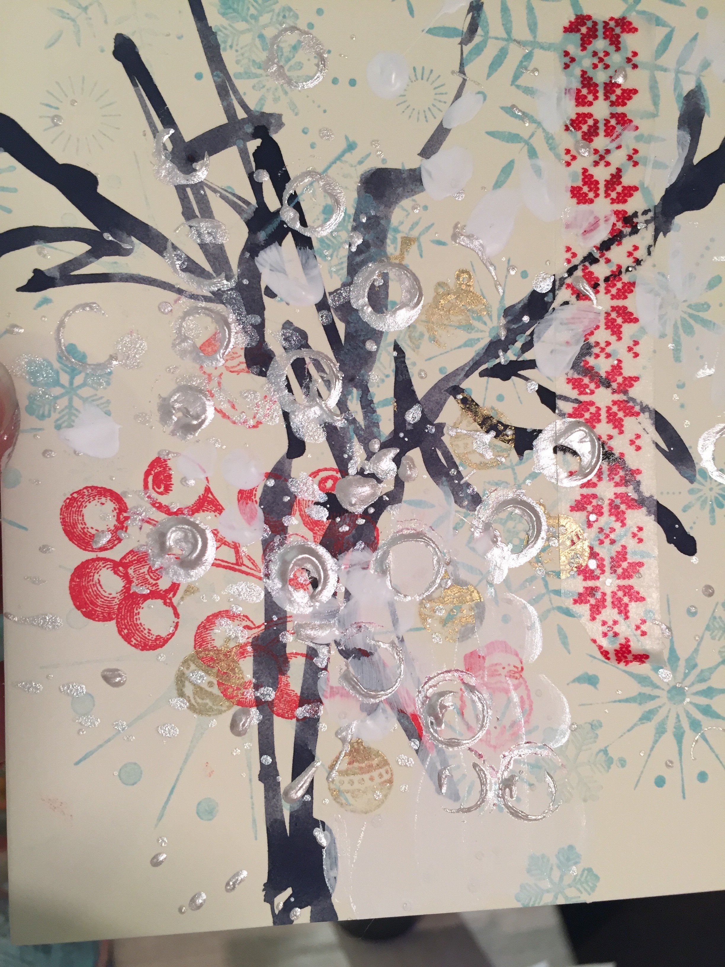
6. Red berry stamp

IMG_7169IMG_7168


7. White gesso 8. Iridescent white liquid acrylic 9. Iridescent white solid acrylic

** Of course while I was taking these pictures I suddenly blanked and forgot the red berry (GASP!) that I usually put in about the middle before some of the stamps and definitely before the white paint at the end. that's OK though! See example below though where the "red berry" stamp is DEFINITELY ON TOP of the white paint layers but that's totally ok. It's just a slightly different effect then the one below it where it's "behind."

****************************************

MY PROCESS:

    1. Snowflake layering - notice that I vary how I put the stamp on the page, sometimes lining up with the entire stamp to cover most of the page, sometimes not. Notice that not all the "snowflakes" come out perfectly. But that's what I love - VARIATION.
    2. Wasabi tape - that's one of the most fun parts of these cards I think because it really brings a lot of the piece. Some of the tape is bright red, some designs, sometimes gold pattern, other times even green (although I limited the green because that can get obnoxious if used too much with this palette because I wanted to keep things pretty limited). Sometimes I used smaller "accent" pieces and sometimes used a couple different patterns/colors. Other times I ended up using a larger "strip" of tape used as a major focal point. That tape can contribute to the "tree silhouette" coming later or also counterbalance it. But it was fun to use the tape because it's very graphic and very strong piece of design.
    3. Tree silhouette - This is part of the piece that really anchors each one, otherwise the pieces of tape and the little "stamps"  of Christmas designs would just be out there floating. The tree also lends itself to a very organic element of design, we can all identify quickly with what I'm trying to depict without getting too specific. It also is fun because it adds a "hand-element" or painterly aspect which I very  much like.
    4. Red Berry - is definitely an accent graphic. I love the graphic because it's detailed and nostalgic. But I really like how I could use it to blend into the tree or rotate it around - mostly at a diagonal if you notice. It gives a lot of movement and again an accent without being too "loud" and in your face.
    5. More little stamps were fun to interchange in between all the layers and it depended on which stamps because like the Santa Face, that's very identifiable. So I didn't want to overuse it (I'm still at heart an abstract painter!). But those are fun little accent and "surprises" for the viewer and also keep in mind the over all "shape" of the stamp. A "candy-cane" is different then the wreath which is a circle, etc.
    6. The ornament stamp was fun because it brought the gold ink into the piece rather nicely. It plays a supportive role but enhances the idea that the tree has ornaments without being too literal. But the gold really helps keep a "neutral" in the midst of all that bright color etc and then also can unify the piece, and play another supportive role if the wasabi tape is gold too.
    7. White gesso - Used this in "blobs" to kind of mimic snow. I didn't want to overdue it thought because gesso is opaque and it would just block out whatever is beneath it. But because it's pure white, it was fun to use as a starting point for now.
    8. Iridescent white liquid acrylic paint is fun for "blotting" or "flicking" the paint brush to make much smaller droplets of paint and since it's iridescent it reflects the light.
    9. Iridescent white solid acrylic paint was my second favorite layer because I accidentally just started playing with "stamping" the tube of paint, using it totally as a stamp and out came these cool circles/semi-circles and created a really fun overall texture to each piece.

****************************************

Tip #2 - HAVE FUN, HAVE FUN, HAVE FUN! Don't get too worked up about when you put this or where or if you (heaven forbid!) missed a step etc.  You  might want to practice 1-4 cards at the beginning to experiment freely and get your rhythm what you are going to do. At the end, "stamping" a tube of the iridescent white solid acrylic paint worked so well for about 25 of the cards and then that last 9 or so, the paint start to wear out and the "bubble" that inevitably had made this cool "circle stamp" that was totally organic and free suddenly started plopping out GOBS of paint. You just worked with it. I dabbled some of it back up with a paper towel and other times just using a brush to "paint" back in some marks that didn't have anything to do with anything. But it was fine. Not what I wanted intentionally because the first time I picked up the tube of paint I excitedly stumbled on this cool texture by accident. But also, this kind of accident not totally worth welcoming but you have to sometimes make work what are "real" accidents and not just happy ones that you delight in. It's all part of the process and it's all part of "LETTING GO."

IMG_7170IMG_7191


****************************************

See the final 36 pieces here in the gallery.


Tip #2 Play like a kid again (10 Tips for Freestyle Painting)

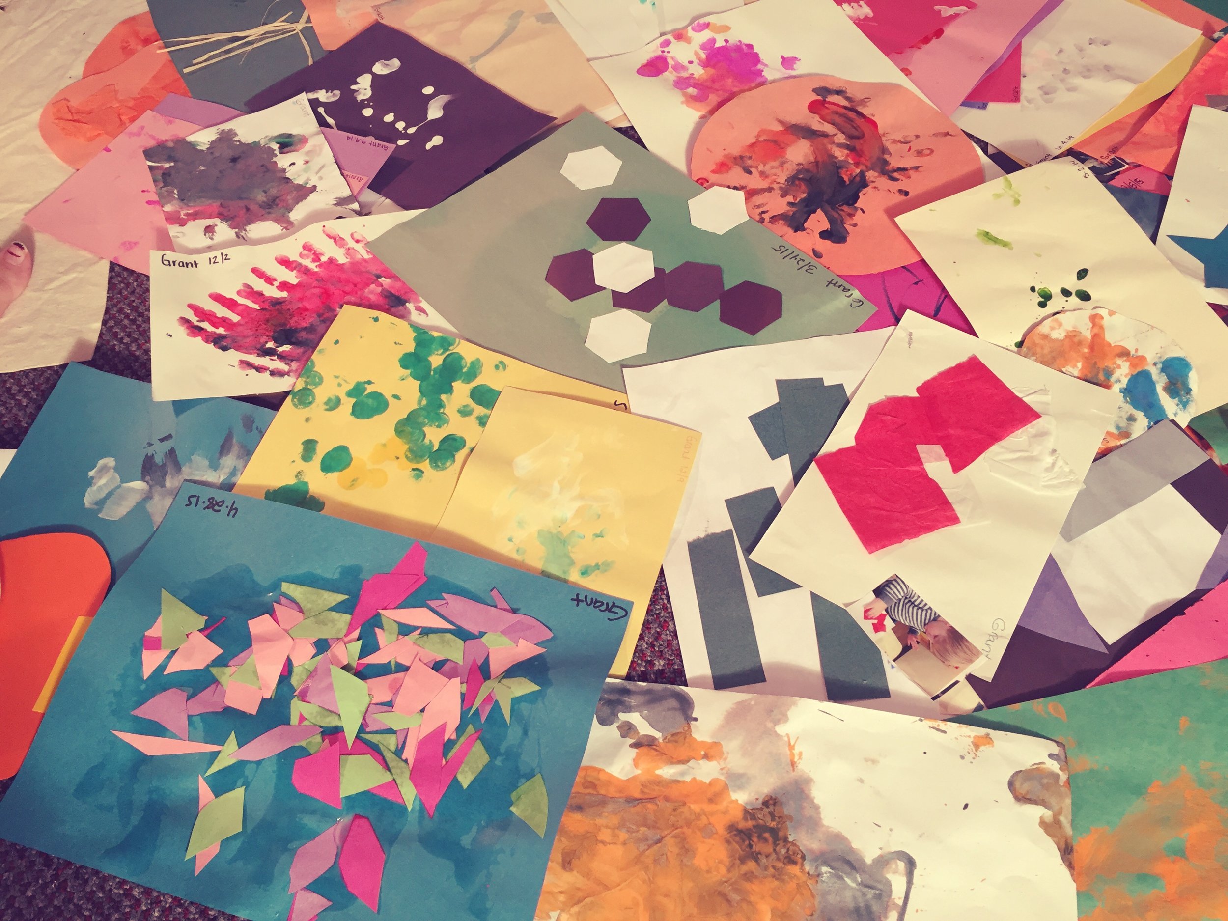
Paint Like a Kid Again!Tip #2 is to let yourself go like your a little child. Envision a time when you remember playing as a child having so much fun on a creative project (spontaneous, in the moment, delight in each act without judgment, etc. - think of child or your child, they try, try, try, try, try, try and try again until . . . they get it!, squeal with delight! They are so PROUD and want your approval (your inner child wants your approval).

And remember these tips:

- Taking pleasure in the moment not the destination - You are your harshest critic - What does it mean to you to be “artistic?” “an “artist?” creative? intuitive? - Notice your immediate mental reactions to these words and release them with forgiveness and kindness - Now be here in moment, right now. Close eyes. Put on favorite music and put on repeat for 20 minutes. Close eyes, take 3 deep breathes, and start. Don't think! - Slop it on, pool it, have fun - Enjoy the physical act of moving the paint around on your surface with brush, palette knife, any other tool, etc. Really notice how the paint behaves, if you had more water, less water, more oil/mineral spirits, less.

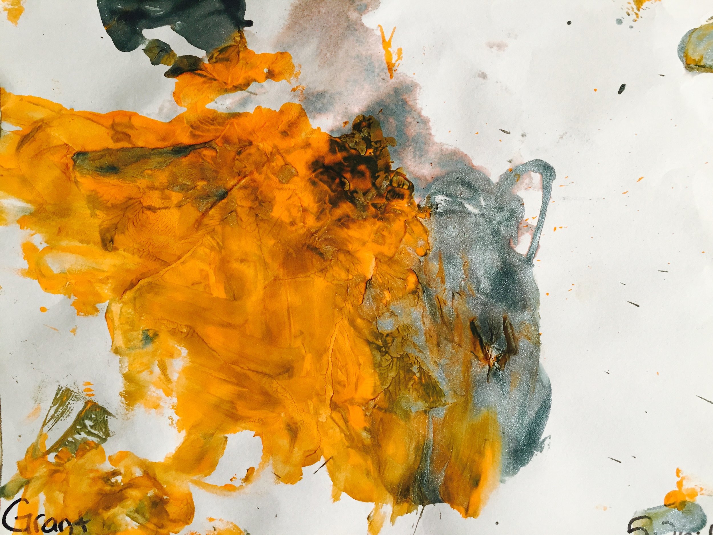
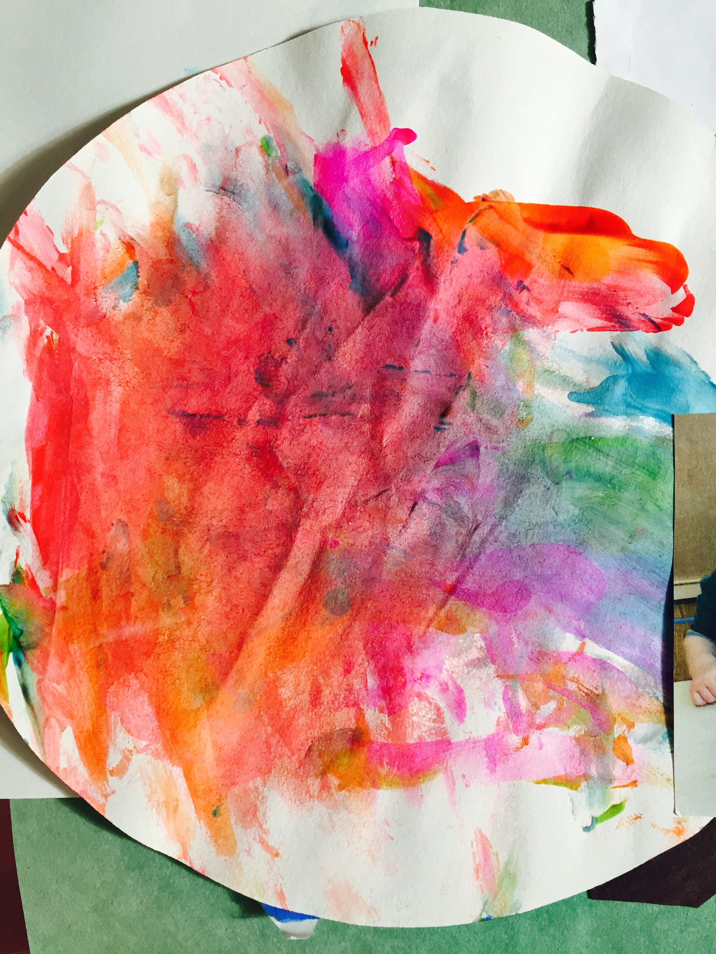
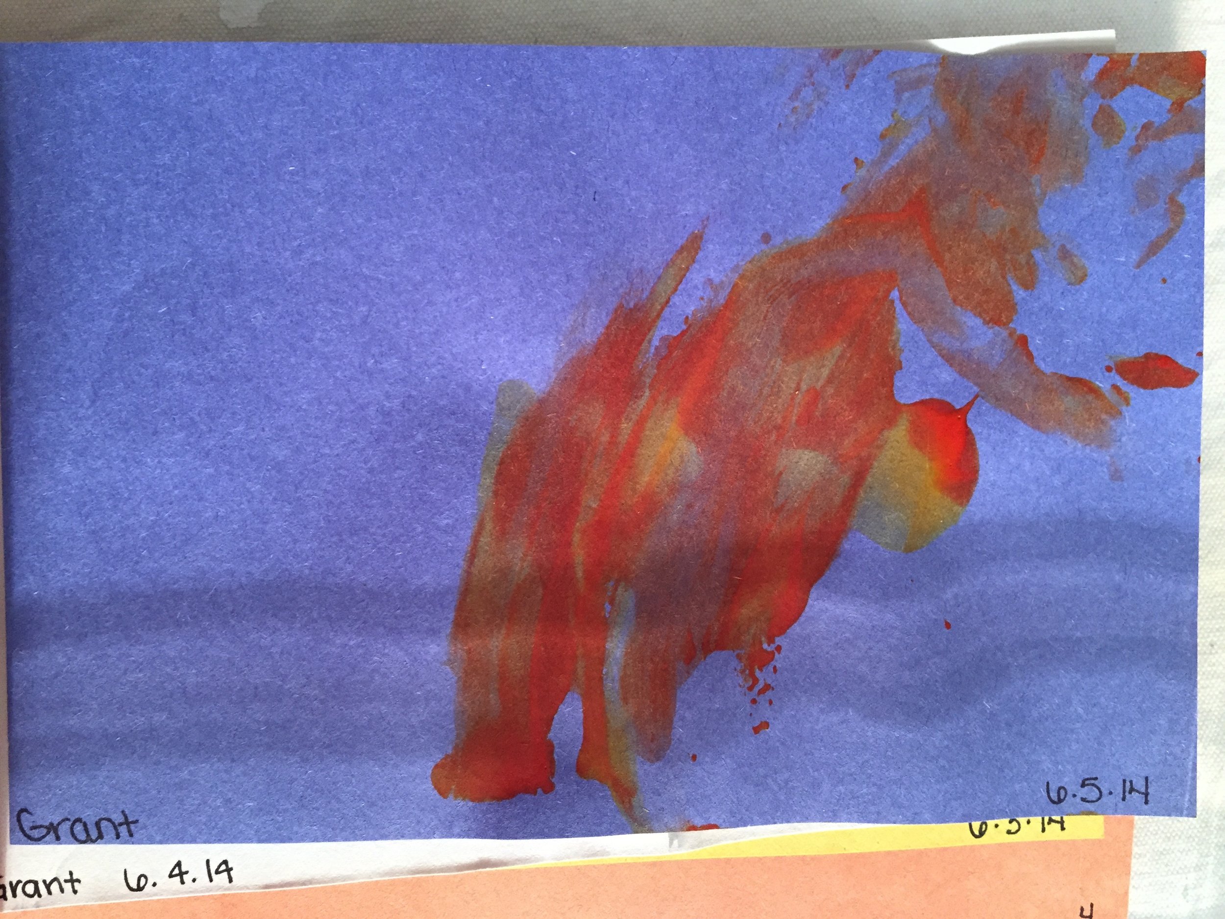
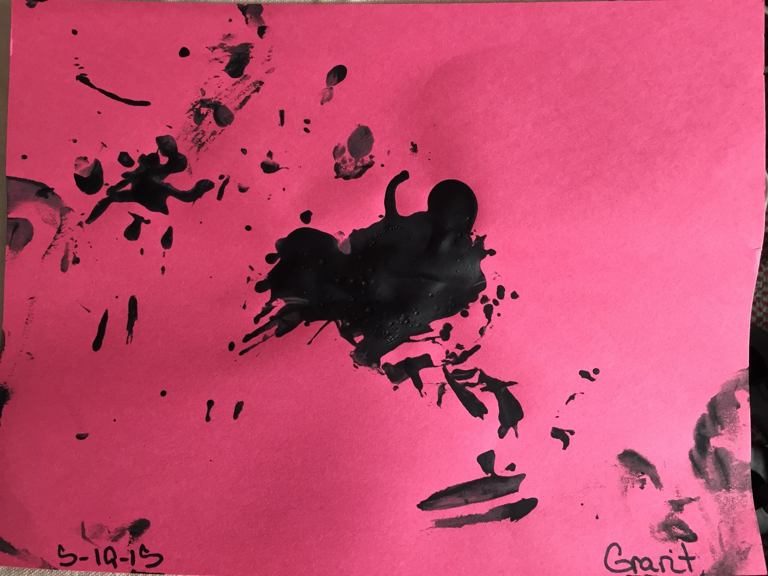
These are all artwork from my son. He's tiny, artwork spanning when he first starts at 6 months to now 20 months. The latest works I love. They are so spontaneous, free and  there's such genuine experimentation. But most of all he does not care at all what happens. It's the sheer joy in the moment of putting that brush with the paint or glue or whatever to the paper. Then he lets it all go and moves on in the day to snack time or play time or whatever. But the marks are there to prove there was something in that moment that he connected with. And that is the feeling of total bliss with yourself, trusting yourself, your intuition and tell your left-brain critic to shut up! Just this once! Who cares?! :)

Paint Like a Kid Again! Paint Like a Kid Again! Paint Like a Kid Again! Paint Like a Kid Again! Paint Like a Kid Again! Paint Like a Kid Again! Paint Like a Kid Again! Paint Like a Kid Again! Paint Like a Kid Again! Paint Like a Kid Again! Paint Like a Kid Again! Paint Like a Kid Again!

Tip #1 Embrace the Blank Canvas (10 Tips for Freestyle Painting)

blank canvasSelf doubts plague all of us, but especially newbies who are prone to be particularly self-sabotaging. The only difference is that as you learn the process and begin to trust yourself, you start to feel comfortable with being uncomfortable about painting and just “keep going.” But as with anything, you have to START.

What first comes to your thought when you think  art, artist, creative, intuitive? Write out your initial thoughts.

Now what first comes to thought when you put the word “me” in front of it? Write out your initial thoughts.

Oh believe me does any of these negative thoughts sound familiar?

I’m not an artistI can’t paint! That’s WAY WAY Too scary and way too artistic! • I’m more of a craft/project person - tell me what to do and how to do it and I like that more • You have to be “born” a painter - it’s in your blood! • I loved painting as a child, but never “did it right I guess” or was told I wasn’t that good, so I thought I wasn’t • Painting is way too frustrating because I have an “idea” in my head and it never comes out the way I want • Freestyle painting is the ultimate intimidation! How the heck am I supposed to paint abstractly when I have no idea what I’m painting to begin with! •Blank canvas is the most terrifying thing for me. As soon as I start I truly love working with the painting but I have major blank canvas syndrome

Ok answers to all of the above is just to START, START, START, START!

And take a second to just think about this: When you cook, you don’t stress out staring at the counter tops or the oven/stove in disbelief because you can’t cook! You don’t pull out all your ingredients and just stare in horror that somehow these items will be put together into some dish that will be delicious? You know the eggs, butter, flour, salt, vanilla extract, etc. (totally separate and kind of weird objects in themselves when you sit to think about it) will be parts of the total whole, which are cookies! You also know that while dough is yummy, it’s really not what is the end project. Cooked cookies are the finale (even though yes, we all make cookie dough and stop right there!)

My point is that you just start.  You don’t question yourself IF you are a cook, you just are. You are a cook because you are cooking! Now you may not consider yourself a gourmet cook, a good baker or griller or perhaps you just throw things together from frozen stuff or left overs or whatever. But you still are in the act of cooking. No matter what that definition is or how it is specifically defined, you cook yourself or your family a meal.

But most importantly - You also trust the process. You know that all those ingredients will make cookies (now if they are good cookies or not that’s another topic). But right now it DOES NOT MATTER. Just get your paints, get your water and get your brushes. Find that paper or canvas or board or whatever you want to paint on . . . and set your timer to paint.
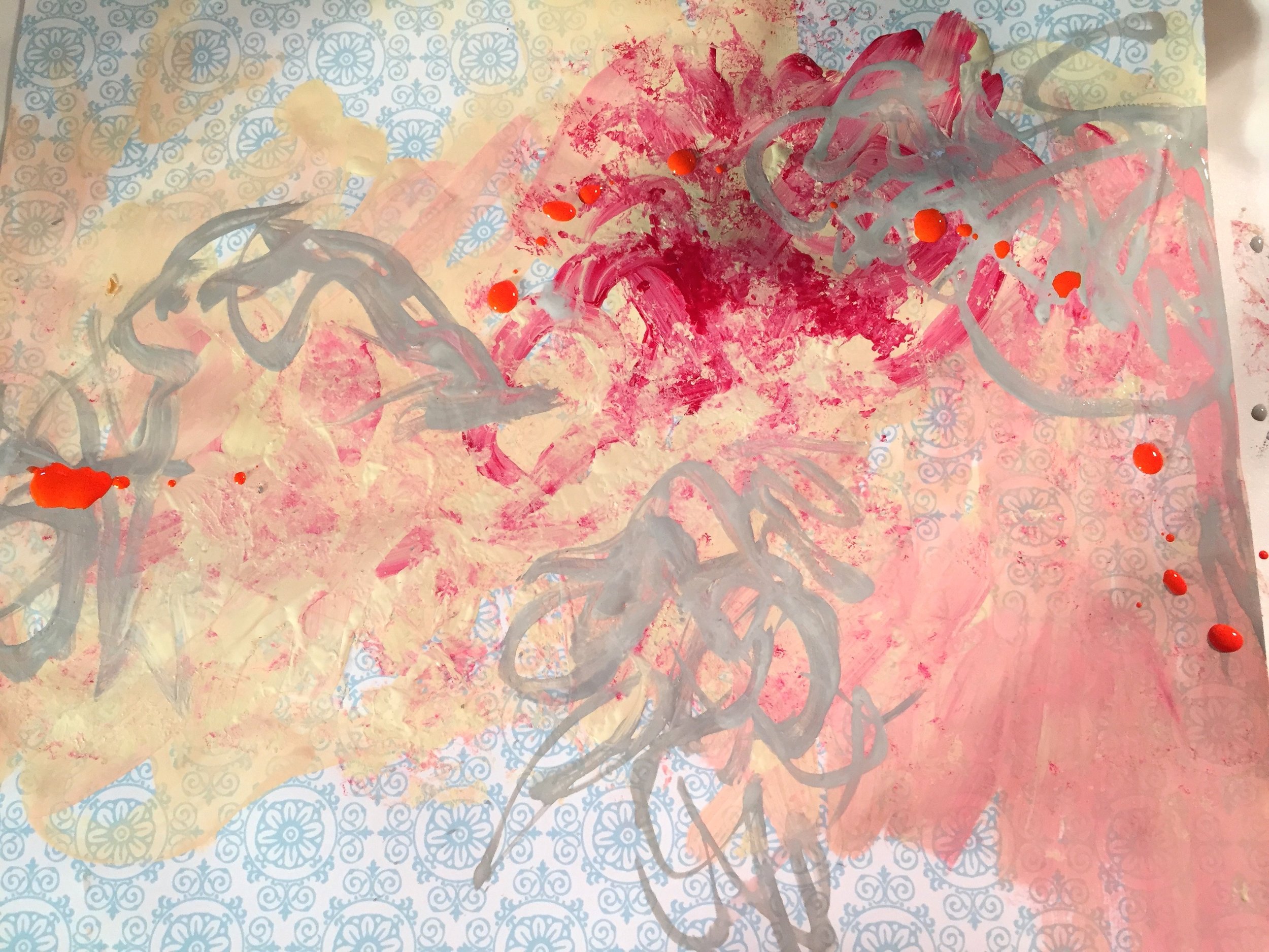
If you want to start, just begin with 20 minutes - set your timer on your iPhone or whatever and paint till the beeping goes off. And then put aside and don't judge. Next day, do the same until at some point you hopefully get into it and keep painting after the beeper goes off. But the key right now is NOT TO JUDGE ANYTHING - it's so difficult! I KNOW. Believe me. I've been there many many times. But like a cook, you are an artist, because you are painting right now. And that's all that you need to be aware of right now.

***************************************

My sister shared this cooking analogy with me when I first started to discuss the possibility of going back to school for . . . art. I was living in Chicago at the time in a great job (one that I could probably have still stayed in over a decade later) but my life was empty. I was very depressed (didn't know it then but realized it looking back). I was yearning for a more creative life. But I was not cut out to be a graphic designer for lie, or in advertising or marketing. It just never felt right. But it wasn't practical at all and my husband was completely bewildered that I would even consider going back to school for art instead of MFA in Graphic Design. This analogy really stayed with me - it was so simple but in it's essence very profound.

Check out my post on how it all began for me - the "Painting that changed my life" in college.

Tips & Tricks #3 - Drips

Drips 1    Drips 4 Drips 3 Drips 2 Believe it or not, but drips are actually an intentional strategy in painting. Drips have a loaded history - directly references Jackson Pollock when he shocked the world with his absolute abstract expressionism in the early 1950's. Today in contemporary art, "drips" are actually a "thing of the past" so to speak - most often referencing this type of painting and this era of "Abstract Expressionism" so it might be helpful to be aware of the context of using them but it's not necessary obviously. Only in the academic circles does this stuff get analyzed to grainier level!

But I will add that when I was at the Painting's Edge Idyllwild Residency lead by Roland Reiss in the summer of 2008, I had a critique with the famous Pat Steir. One of my paintings that we were looking at in my portfolio I had turned "sideways" so that the drips were going "horizontal." She actually looked straight at me (she was well over 75 at the time - so she had been the generation following Pollock, etc.) and said "Drips are gravity, you should never have the drips go sideways that's just not done. You should rotate so the drips go "down." Important stuff! :)

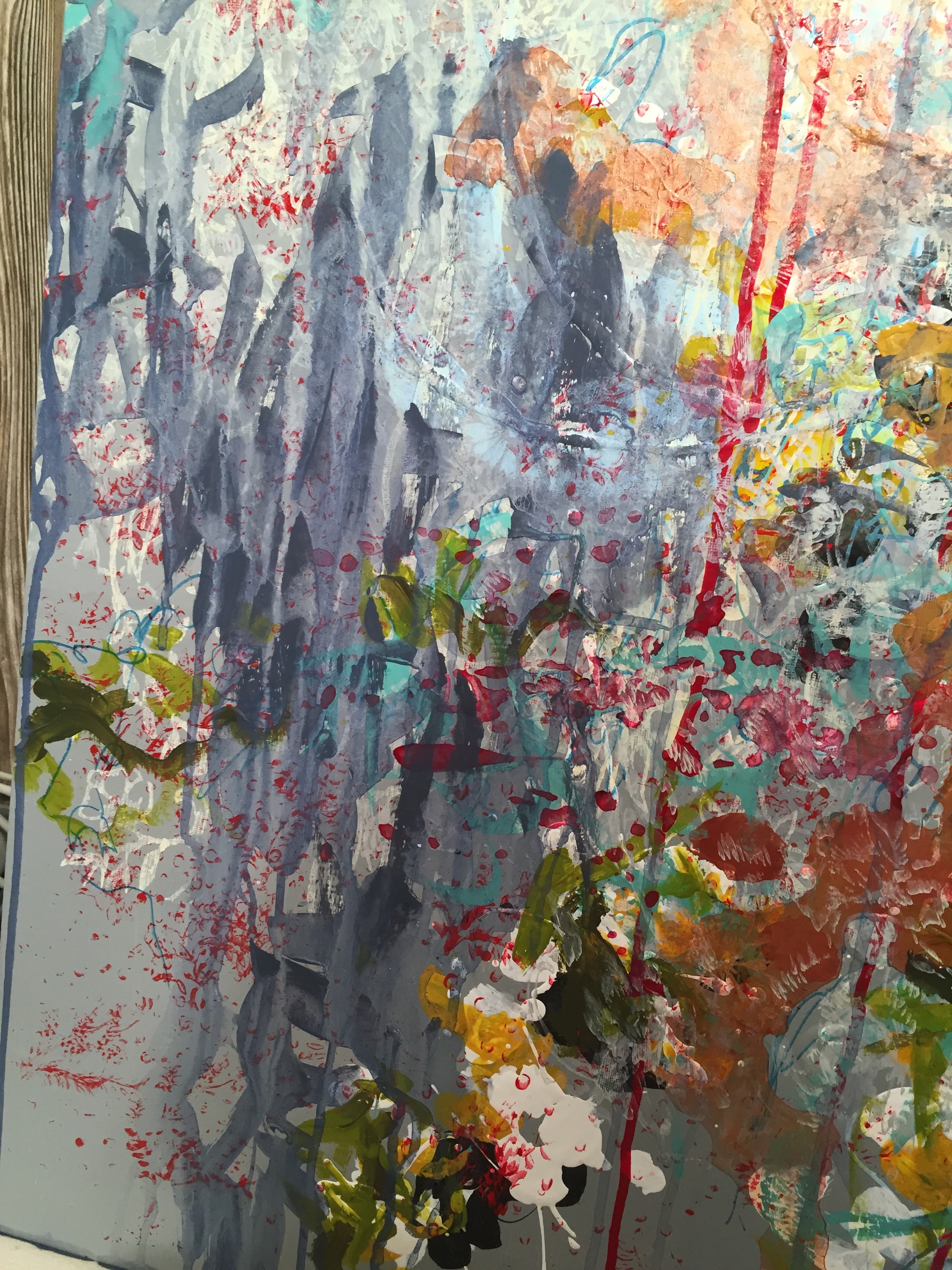
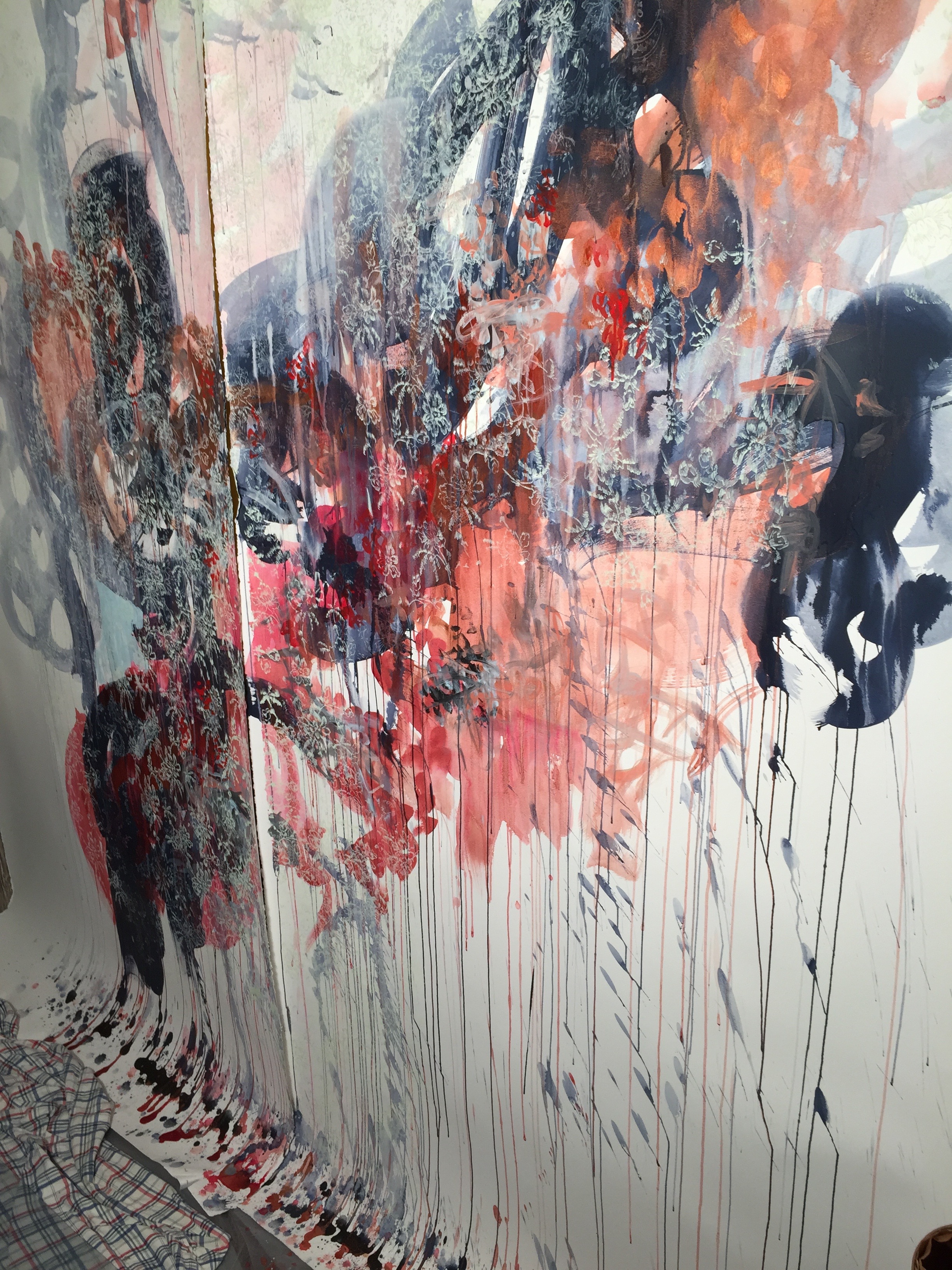
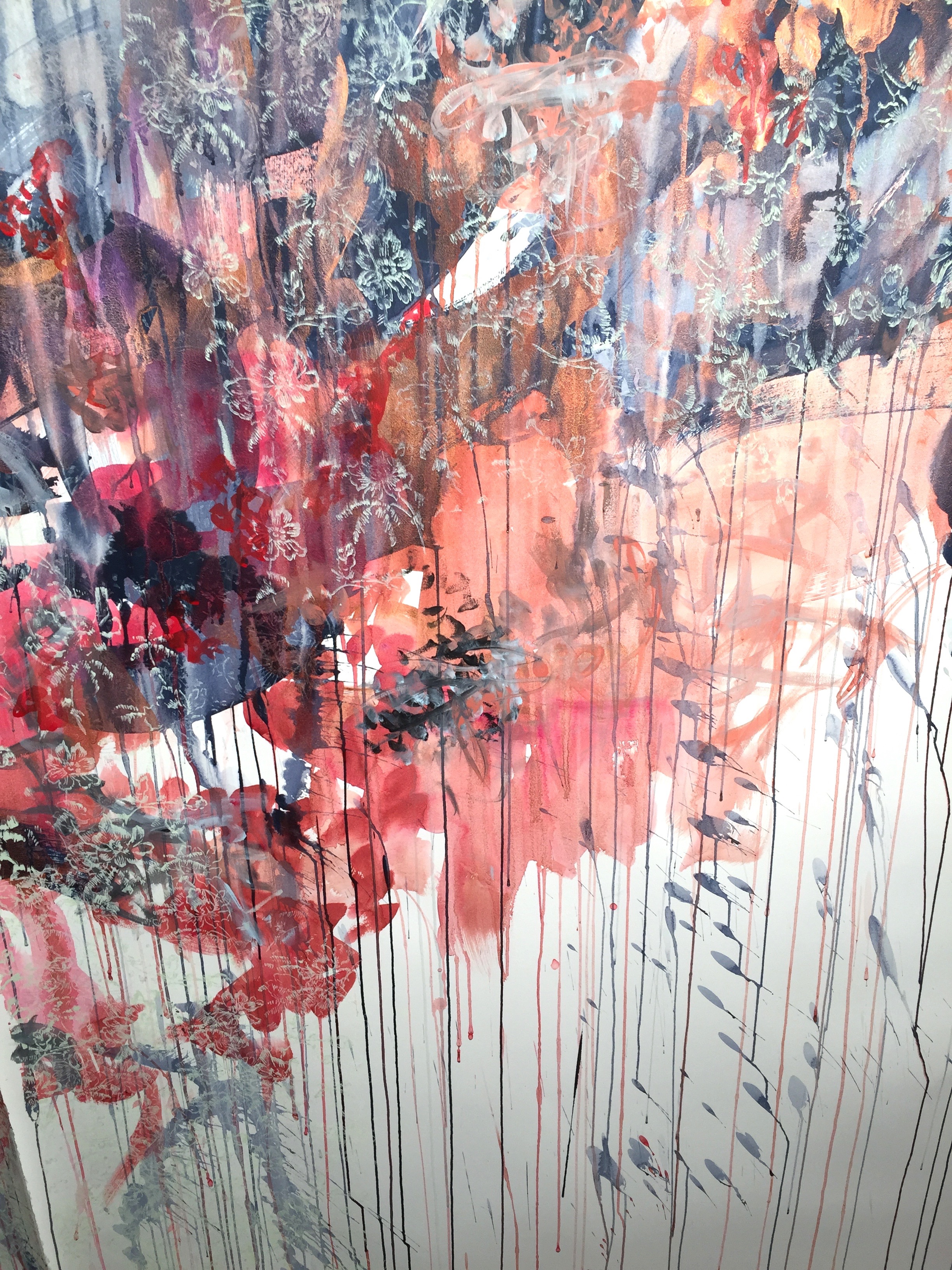
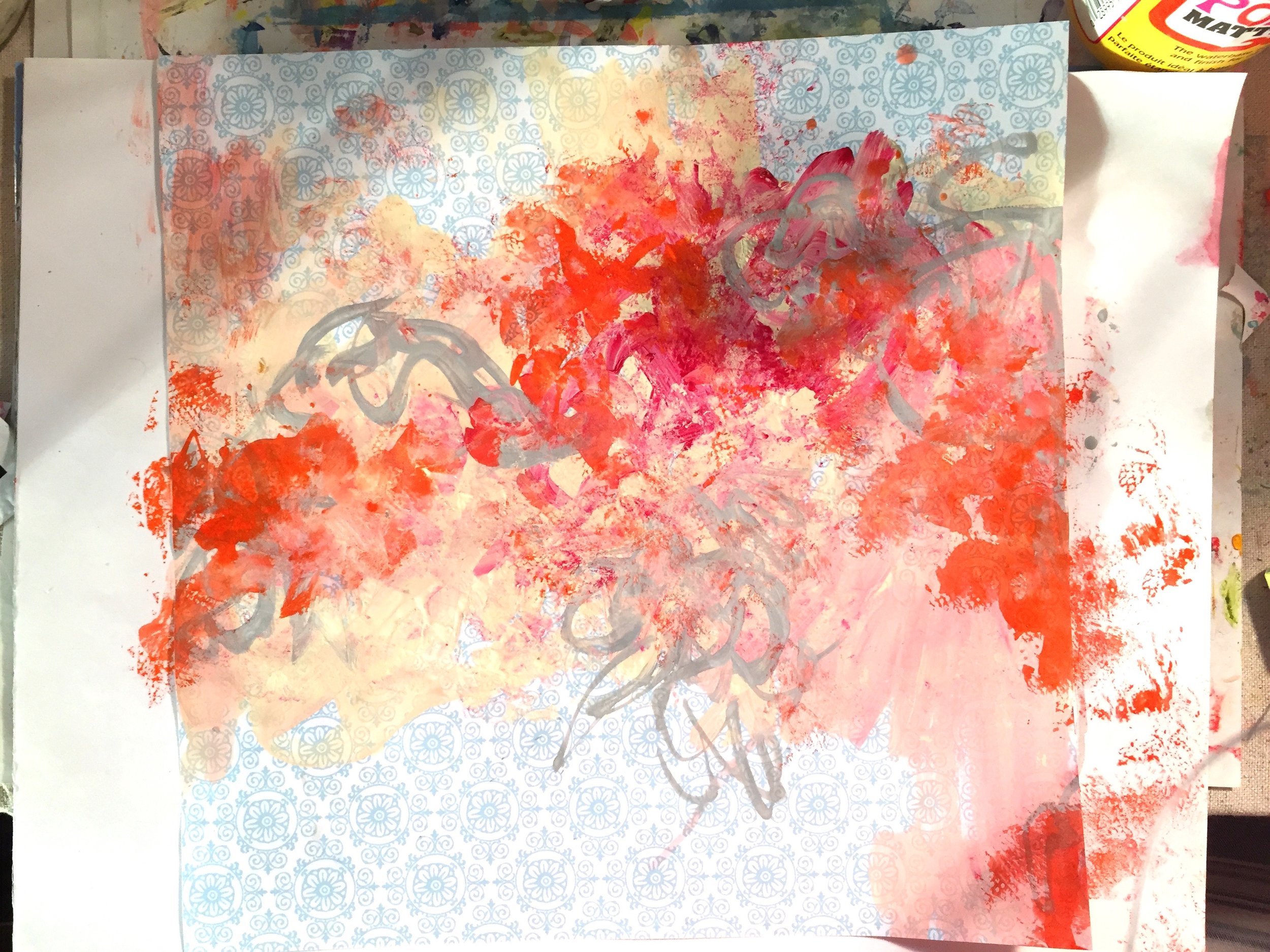
In this painting above, the drips have become an integral part of the overall aesthetic. It looks almost like "stems" from some floral arrangement. I haven't finished this painting yet - still in progress but so far, I plan to keep most of the "drips" towards the bottom of the painting. With this painting, it also is practical. The painting is pretty large (4 feet x 6 feet) and it is on panel so it's actually difficult to put on the floor so this easy and most practical thing is to keep it leaning against the wall to paint. So in this way, the paint drips are inevitable. But I haven't worked with drips in a while, so I think the effect is lovely. The drips here are very straight-forward, used only with water.  You can use matte mediums and gels to get "slower" drips that build up from the surface too.

Drips 5 Drips 6 Drips 7

These drips in this painting are starting to look very much like series of "line" and the line quality, even though random, is really quite lovely as well. But who knows what the finished will look like. This is another example of practicality - this piece is a large paper piece and there is no way right now in my studio, that I can put any of it on the floor. But I LOVE the bottom - probably will try to keep most of it, the random drips, drops and lines that are all completely accidental!

Tips & Tricks #2 - Blotting

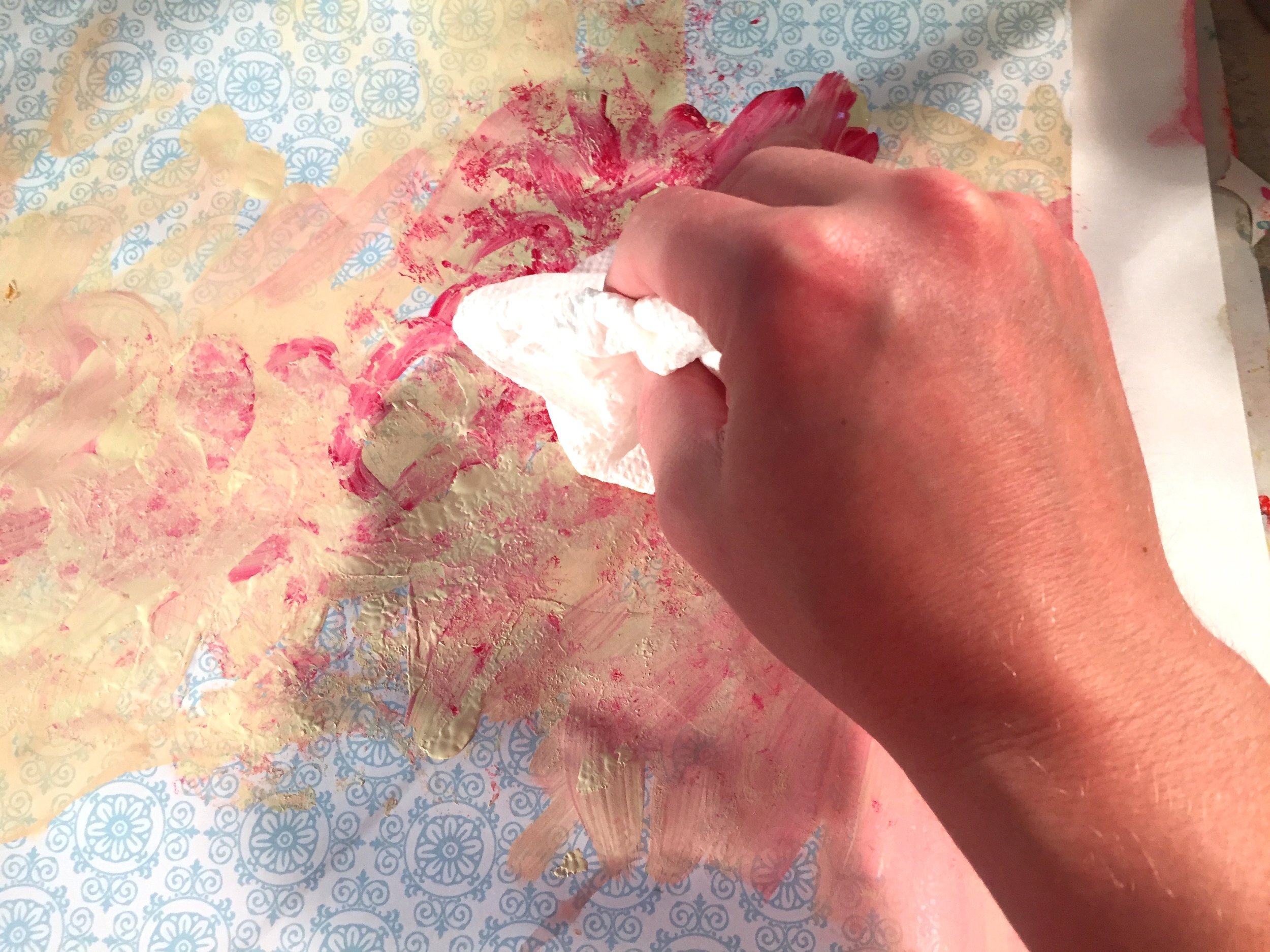
Dabble 1 Dabble 2 Don't forget a great "technique" which is blotting. Since working on the 100 Day project, I don't have my usual time to just let things "dry out." So I have been drying as much as I can (which is only like 30 seconds!) with a hair dryer and then blotting what would've take a while to dry on it's own. You can blot with anything - obviously the quickest is just a paper towel. But any cloth or something that will absorb some of the paint and then what happens at least with the paper towel is that it "grabs" and lifts some of the paint and then blotting back into the painting puts that left over paint back into the painting. The effect is definitely just another fun technique. It also softens some of the paint.

But don't forget to experiment with different kinds of paint. In this piece (Day 31 of the 100 Day Project), I deliberately started with the thicker Annie Sloan chalk paint and decided it was too thick and began blotting it out. It lifted the paint so it wasn't in just thick globs.

Pour paint 1Pour paint 2 IMG_3810You can also drop in paint from the tube right into your painting and force yourself to work with it as well. With this though, the orange was just too strong and I wasn't feeling the "drops" so I used paper towel to blot the orange--which soften the effect. It also is a much thinner, acrylic paint (I think it was the fluid Golden paint) so by nature it will be transparent.

New favorite paint - Annie Sloan

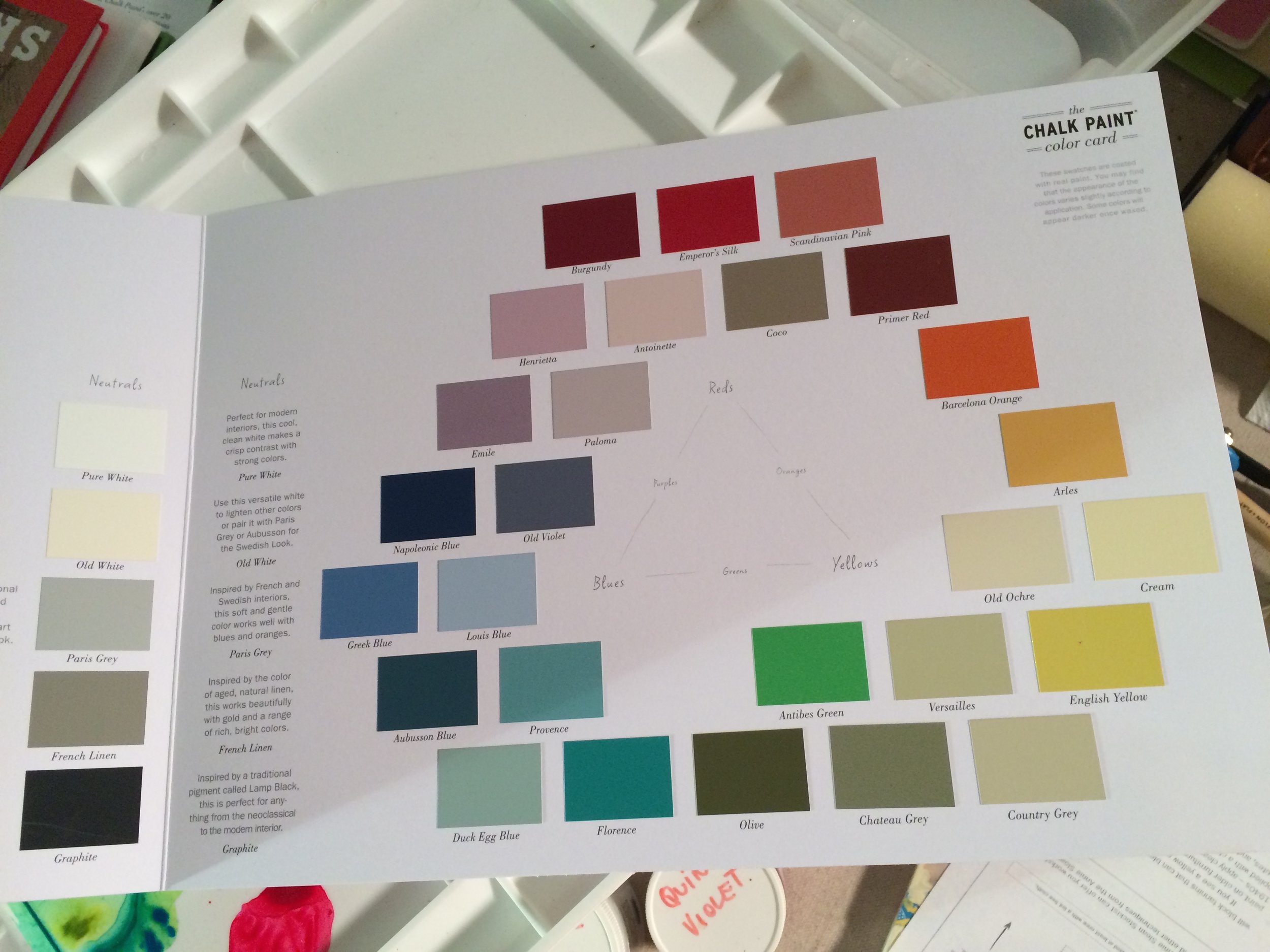
Annie Sloan Chalk Paint After testing out Annie Sloan's chalk paint, I want more! Totally have fallen in love. It's a great consistency for painting. Obviously, the paint is designed for redecorating and refurbishing furniture, floors, walls, etc., anything decorative and in your house (lamps, book covers, etc.). It is nontoxic, completely flexible enough to use right out of the can or water it down with some water, etc.

But my favorite thing are the colors. I do not like to mix colors cause I'm just too darn impatient. It's weird I know but I tend to paint fast and like to just grab paints out of the bottle. Occasionally if I have a specific color in mind I will take the time to mix. But I absolutely LOVE all thing British and their color schemes are no exception. I've oftentimes taken the color samples from Farrow-Ball to Lowes to create the paint colors. For example, the Brits have just such beautiful gray colors. I feel like the US has warmer gray colors or darker. Brits have such a beautiful, soft, cool gray - probably inspired by a lot of cloudy days actually! But Annie Sloan's paints are awesome. You can mix them together to make new colors. But also there are a lot of neutrals that I can just get right out of the bottle. (For example the gray used to calm down this painting in my 100 Day Project sketch). I can only afford 1 quart right now which is "Cream" that I'm working on for my new painting series. But I can't WAIT till I can afford more. Lovely! :)

Tip - be on the lookout for other materials that you wouldn't necessarily think are related to painting but it is! Test them because all paint is different consistency. Advised to stay away from all oil-based paints because they are very hard to work with, they cannot be used for the first layer because if you put water-based layer on top of oil, the oil will corrode the water-based layer - unless you want to experiment with that!). But waiting for oil to dry is a drag (could take days), and it's messy, toxic and you have to do a lot of clean-up (check local and national requirements on disposal of oil-based painting products, etc. because there's a lot now a days). Water-based or "Acrylic-based" paints are much better for you, and much easier to work with.

IMG_4104

tips & tricks #1 - Japanese Paper

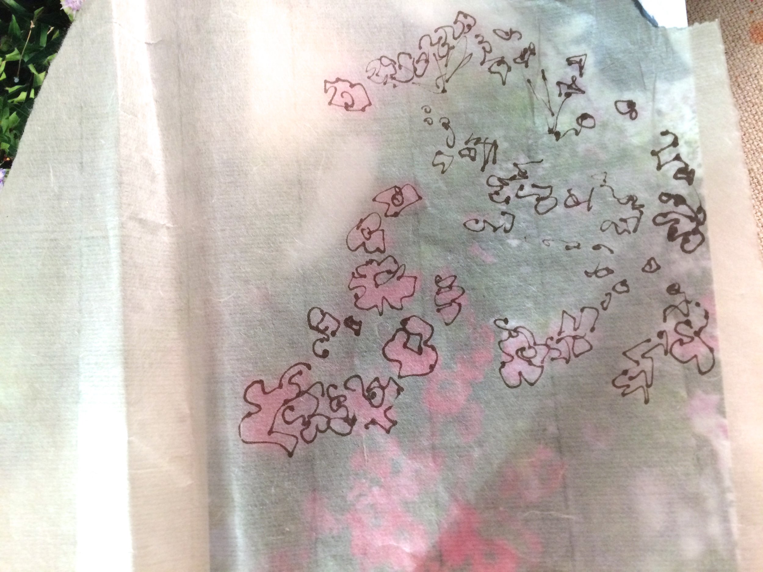
Tips & Tricks - Japanese Paper Tips & Tricks - Japanese Paper One of my favorite techniques has always been to use Japanese paper. Now there's a lot of different variations of this type of paper and I am now looking for variations on the paper that I currently have because it's not available anymore from the vendor I used to get printmaking paper. But the kind that I love using right now is very airy, soft, super delicate, transparent, handmade and easily can tear etc. So stay tuned because I have to experiment pretty soon here with different kinds and I'm not sure I can find the kind that I love pictured here! But oh well. Have to move on! But I have always loved to draw over this type of paper and then to paste the paper itself into my paintings as these soft layers that give this beautiful translucent effects. You can control how "translucent" you let the paper get when you apply a basic medium to "glue" it to any painting surface. Add more water and it becomes more transparent.

I also highly recommend using your own photos. Here I have photo of flowers I took in England and I liked the composition enough to just play on top. I loosely drew my flowery sketches not caring at all if they were "exact." It's just a reference.

If you use other images, make sure they are general, like general patterns or other neutral imagery so you don't get into any issues with copying other people's stuff if you want to sell this painting. But it's really more fun to use your own stuff and get inspiration from yourself.

But the effect creates a loose, sketchy look like you really did draw onto the painting surface but also includes some kind of layered effect. Experiment with different paper and all different kinds of colors of pens, pencils, charcoal you name it. Sky's the limit!

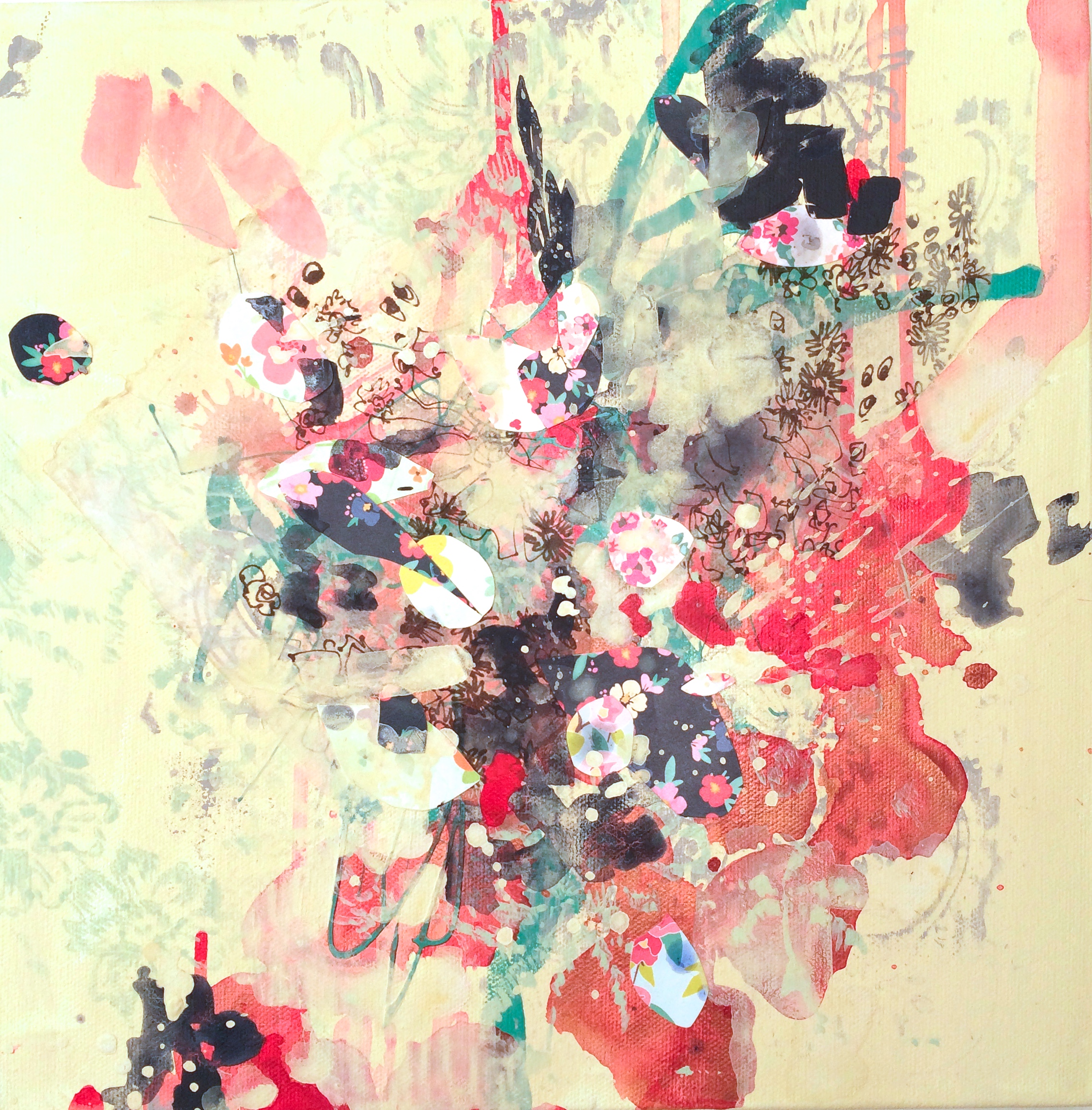
In this series below you can see where I applied this effect.